2025
Brand Guidelines.
Our Mission
“To provide members with a sustainable competitive advantage.”
Independent Insurance Agents & Brokers of America
Big “I” usage
This logo presents our products and services as one and will help independent agents and companies clearly identify resources, services and experiences that are uniquely Big “I”. The use of the new identity will also help separate the industry facing and consumer identity which has become increasingly important with social media.
When promoting multiple programs use Big “I” ASSOCIATION logo (R). We want to keep from using multiple logos on one piece—we are one organization offering multiple solutions and stronger together.
When promoting one program, use the PROGRAM logo(R).
Use color palate, font, graphic elements and photo treatments in the following guidelines.
Use full company name in first reference Independent Insurance Agents & Brokers of America.
Website address should be: independentagent.com/program.
Whenever possible include “Empowering Trusted Choice® Independent Agents” with the Trusted Choice logo on all website and printed materials. We are going to embrace the cobrand and illustrating the importance of the brand in the mission of the Big “I”.
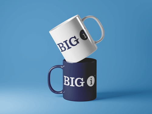
Most giveaway items (pens, bags) for companies should use the Trusted
Choice logo. If an item will be worn, carried or used by an agent when they meet customers or displayed in their office, the preferred logo is Trusted Choice consumer identity. It’s who they are.

Logo Usage
Logo Clear Space
The minimum required Clear Space is defined by the measurement ‘Xʼ (equal to the height of the uppercase letters, known as the ‘cap-heightʼ. The width is equal to the height.)
There should always be a minimum clear space of the width of the uppercase “I” width within the Big “I” brand logo.

Logo Color Usage
These are the Big “I” logos to be used in color printing and online. These logos should be used in all applications when applicable.


Logo Do’s
Please follow these guidelines to ensure that the logo is visible, legible and used in good taste.


Logo Don’ts
Make sure to use the logo versions provided and do not alter the logos.


General Guidelines
When promoting multiple programs use Big “I” ASSOCIATION logo. We want to keep from using multiple logos on one piece—we are one organization offering multiple solutions and stronger together.
When promoting one program, use the PROGRAM logo.


Association Logo Usage: Promoting multiple solutions


Program Logo Usage: Promoting one program solutions (examples below)
Trusted Choice Usage
Company pieces will be branded Big “I” and will include the Trusted Choice logo with “Empowering Trusted Choice® Independent Agents.”
Totebags, lanyards, gifts, pens, shirts, cups, candy, prizes, certificates, awards anything that goes home and gets displayed or used should have the Trusted Choice logo—this is WHO THEY ARE. It’s about them, not our services at that point.
Website footer will contain Trusted Choice logo with “Empowering Trusted Choice® Independent Agents.”
Consumer videos, Trusted Choice logo should be used.


Color & Typography
Color Theme
The Big “I” primary colors are the main theme of colors in logo, branding marks, marketing and on the website. These swatches are used overall, with secondary colors used as an accent.
Secondary colors should be used to emphasis, differentiate or highlight between programs and campaigns.
Primary Colors

Pantone 288 CP
C 100 M 93 Y 35 K 28
R 32 G 41 B 91
#20295B

Pantone 284 C
C 63 M 22 Y 0 K 0
R 85 G 164 B 218
#55A4DA

White
C 0 M 0 Y 0 K 0
R 255 G 255 B 255
#FFFFFF

Pantone Neutral Black
C 0 M 0 Y 0 K 100
R 35 G 31 B 32
#231F20
Secondary Colors & Gradients

C 4 M 33 Y 92 K 0
R 242 G 177 B 52
#f0f6fb

C 4 M 33 Y 92 K 0
R 242 G 177 B 52
#F2B134

C 66 M 3 Y 47 K 0
R 79 G 185 B 159
#4FB99F

C 1 M 82 Y 83 K 0
R 255 G 255 B 255
#ED553B
C 0 M 0 Y 0 K 40
R 237 G 85 B 59
#A7A9AC

C 65 M 70 Y 0 K 0
R 126 G 90 B 237
#7e5aed

Type: Linear, Angle: 0°
#20295B 0%
#55A4DA 100%
Type: Linear, Angle: 90°
#f0f6fb 0%
#FFFFFF 100%
Typography Theme
Futura is used for the logotype/logo wording with program and solution names below the horizontal divider. It is also used for all headlines and occasional body text, ranging from: printed pieces, website design, brochures and all forms of marketing.
Open Sans font family
is to be used for all other
forms of standard body text, ranging from: web text, white papers, brochures.
Clarendon is the primary font used for the logotype/logo wording Big “I”. It can also be used as the standard when stronger emphasis or attention is needed, such as in: stationery, website design, brochures and all forms of marketing.
Arial font family is used for headlines and body text in
official conference and building signage and other areas where text is functional.
Headings

Body

Accent Styles

Typography Theme
The Big “I” website has seven heading options, ranging from an H1 display to the smallest H6. Paragraph options range from an Extra Small paragraph to an Extra Large paragraph, with options to bold, italize or use a drop cap at the beginning of a paragraph. The Kicker Heading option will be used directly above a main headline of an article or to further categorize the article’s subject matter.
Pullquotes have three styles options to highlight the content. Use an ordered list when the order of items is used to provide sequential information. Use an unordered list when you create a list of items where the order does not matter.
All heading, paragraph, pull quote, and list font color are determined by the background color, with the default being the dark blue. All fonts are a san serif font. Button options are either light blue, white, or plain text. Button options include a filled, outlined, or plain text option. Button color and font color is determined by background color.
Heading Display
Lorem ipsum dolor sit amet, consectetur adipiscing elit. Donec tortor lectus, vehicula eu tempor nec, rhoncus sed erat. Vivamus dapibus eleifend lectus, eget egestas enim. Praesent posuere lorem non leo sollicitudin accumsan. Pellentesque elementum metus eget augue sagittis euismod. Nunc finibus tempor rutrum. Aenean ac lacinia dui. Cras scelerisque suscipit nisl sit amet venenatis. Phasellus ut metus pharetra, tristique ex eu, ornare odio. Donec congue dui est, sit amet aliquam tortor congue eu. Aenean orci nulla, luctus nec pellentesque a, vulputate eget nisi.
Heading H1 Lorem
Lorem ipsum dolor sit amet, consectetur adipiscing elit. Donec tortor lectus, vehicula eu tempor nec, rhoncus sed erat. Vivamus dapibus eleifend lectus, eget egestas enim. Praesent posuere lorem non leo sollicitudin accumsan. Pellentesque elementum metus eget augue sagittis euismod. Nunc finibus tempor rutrum. Aenean ac lacinia dui. Cras scelerisque suscipit nisl sit amet venenatis. Phasellus ut metus pharetra, tristique ex eu, ornare odio. Donec congue dui est, sit amet aliquam tortor congue eu. Aenean orci nulla, luctus nec pellentesque a, vulputate eget nisi.
Heading H2 Lorem Ipsum
Lorem ipsum dolor sit amet, consectetur adipiscing elit. Donec tortor lectus, vehicula eu tempor nec, rhoncus sed erat. Vivamus dapibus eleifend lectus, eget egestas enim. Praesent posuere lorem non leo sollicitudin accumsan. Pellentesque elementum metus eget augue sagittis euismod. Nunc finibus tempor rutrum. Aenean ac lacinia dui. Cras scelerisque suscipit nisl sit amet venenatis. Phasellus ut metus pharetra, tristique ex eu, ornare odio. Donec congue dui est, sit amet aliquam tortor congue eu. Aenean orci nulla, luctus nec pellentesque a, vulputate eget nisi.
Heading H3 Lorem Ipsum
Lorem ipsum dolor sit amet, consectetur adipiscing elit. Donec tortor lectus, vehicula eu tempor nec, rhoncus sed erat. Vivamus dapibus eleifend lectus, eget egestas enim. Praesent posuere lorem non leo sollicitudin accumsan. Pellentesque elementum metus eget augue sagittis euismod. Nunc finibus tempor rutrum. Aenean ac lacinia dui. Cras scelerisque suscipit nisl sit amet venenatis. Phasellus ut metus pharetra, tristique ex eu, ornare odio. Donec congue dui est, sit amet aliquam tortor congue eu. Aenean orci nulla, luctus nec pellentesque a, vulputate eget nisi.
Heading H4 Lorem Ipsum
Lorem ipsum dolor sit amet, consectetur adipiscing elit. Donec tortor lectus, vehicula eu tempor nec, rhoncus sed erat. Vivamus dapibus eleifend lectus, eget egestas enim. Praesent posuere lorem non leo sollicitudin accumsan. Pellentesque elementum metus eget augue sagittis euismod. Nunc finibus tempor rutrum. Aenean ac lacinia dui. Cras scelerisque suscipit nisl sit amet venenatis. Phasellus ut metus pharetra, tristique ex eu, ornare odio. Donec congue dui est, sit amet aliquam tortor congue eu. Aenean orci nulla, luctus nec pellentesque a, vulputate eget nisi.
Heading H5 Lorem Ipsum
Lorem ipsum dolor sit amet, consectetur adipiscing elit. Donec tortor lectus, vehicula eu tempor nec, rhoncus sed erat. Vivamus dapibus eleifend lectus, eget egestas enim. Praesent posuere lorem non leo sollicitudin accumsan. Pellentesque elementum metus eget augue sagittis euismod. Nunc finibus tempor rutrum. Aenean ac lacinia dui. Cras scelerisque suscipit nisl sit amet venenatis. Phasellus ut metus pharetra, tristique ex eu, ornare odio. Donec congue dui est, sit amet aliquam tortor congue eu. Aenean orci nulla, luctus nec pellentesque a, vulputate eget nisi.
Heading H6 Lorem Ipsum
Lorem ipsum dolor sit amet, consectetur adipiscing elit. Donec tortor lectus, vehicula eu tempor nec, rhoncus sed erat. Vivamus dapibus eleifend lectu
egestas enim. Praesent posuere lorem non leo sollicitudin accumsan. Pellentesque elementum metus eget augue sagittis euismod. Nunc finibus tempor rutrum. Aenean ac lacinia dui. Cras scelerisque suscipit nisl sit amet venenatis. Phasellus ut metus pharetra, tristique ex eu, ornare odio. Donec congue dui est, sit amet aliquam tortor congue eu. Aenean orci nulla, luctus nec pellentesque a, vulputate eget nisi.
Small Paragraph. Lorem ipsum dolor sit amet, consectetur adipiscing elit. Donec tortor lectus, vehicula eu tempor nec, rhoncus sed erat. Vivamus dapibus eleifend lectus, eget egestas enim. Praesent posuere lorem non leo sollicitudin accumsan. Pellentesque elementum metus eget augue sagittis euismod. Nunc finibus tempor rutrum. Aenean ac lacinia dui. Cras scelerisque suscipit nisl sit amet venenatis. Phasellus ut metus pharetra, tristique ex eu, ornare odio. Donec congue dui est, sit amet aliquam tortor congue eu. Aenean orci nulla, luctus nec pellentesque a, vulputate eget nisi.
Default Paragraph. Lorem ipsum dolor sit amet, consectetur adipiscing elit. Donec tortor lectus, vehicula eu tempor nec, rhoncus sed erat. Vivamus dapibus eleifend lectus, eget egestas enim. Praesent posuere lorem non leo sollicitudin accumsan. Pellentesque elementum inline link metus eget augue sagittis euismod. Nunc finibus tempor rutrum. Aenean ac lacinia dui. Cras scelerisque suscipit nisl sit amet venenatis. Phasellus ut bold text metus pharetra, tristique ex eu, ornare odio. Donec congue dui est, sit amet aliquam tortor congue eu. Aenean orci nulla, luctus nec pellentesque a, vulputate eget nisi.
Medium Paragraph. Lorem ipsum dolor sit amet, consectetur adipiscing elit. Donec tortor lectus, vehicula eu tempor nec, rhoncus sed erat. Vivamus dapibus eleifend lectus, eget egestas enim. Praesent posuere lorem non leo sollicitudin accumsan. Pellentesque elementum metus eget augue sagittis euismod. Nunc finibus tempor rutrum. Aenean ac lacinia dui. Cras scelerisque suscipit nisl sit amet venenatis. Phasellus ut metus pharetra, tristique ex eu, ornare odio. Donec congue dui est, sit amet aliquam tortor congue eu. Aenean orci nulla, luctus nec pellentesque a, vulputate eget nisi.
Large Paragraph. Lorem ipsum dolor sit amet, consectetur adipiscing elit. Donec tortor lectus, vehicula eu tempor nec, rhoncus sed erat. Vivamus dapibus eleifend lectus, eget egestas enim. Praesent posuere lorem non leo sollicitudin accumsan. Pellentesque elementum metus eget augue sagittis euismod. Nunc finibus tempor rutrum. Aenean ac lacinia dui. Cras scelerisque suscipit nisl sit amet venenatis. Phasellus ut metus pharetra, tristique ex eu, ornare odio. Donec congue dui est, sit amet aliquam tortor congue eu. Aenean orci nulla, luctus nec pellentesque a, vulputate eget nisi.
Extra Large Paragraph. Lorem ipsum dolor sit amet, consectetur adipiscing elit. Donec tortor lectus, vehicula eu tempor nec, rhoncus sed erat. Vivamus dapibus eleifend lectus, eget egestas enim. Praesent posuere lorem.
Heading
Heading H2
Heading H3
Heading H4
Heading H5
Heading H6
Kicker Heading
Lorem ipsum dolor sit amet, consectetur adipiscing elit. Donec tortor lectus, vehicula eu tempor nec, rhoncus sed erat. Vivamus dapibus eleifend lectus, eget egestas enim. Praesent posuere lorem non leo sollicitudin accumsan. Pellentesque elementum metus eget augue sagittis euismod. Nunc finibus tempor rutrum. Aenean ac lacinia dui. Cras scelerisque suscipit nisl sit amet venenatis. Phasellus ut metus pharetra, tristique ex eu, ornare odio. Donec congue dui est, sit amet aliquam tortor congue eu. Aenean orci nulla, luctus nec pellentesque a, vulputate eget.
“Pullquote. Lorem ipsum dolor sit amet, consectetur adipiscing elit. Donec tortor lectus, vehicula eu tempor nec, rhoncus sed erat. Vivamus dapibus eleifend lectus, eget egestas enim. Praesent posuere lorem non leo.”
Citation
Quote Default Style. Lorem ipsum dolor sit amet, consectetur adipiscing elit. Donec tortor lectus, vehicula eu tempor nec, rhoncus sed erat. Vivamus dapibus eleifend lectus.
Citation
Quote Plain Style. Lorem ipsum dolor sit amet, consectetur adipiscing elit. Donec tortor lectus, vehicula eu tempor nec, rhoncus sed erat. Vivamus dapibus eleifend lectus, eget egestas enim. Praesent posuere lorem non leo sollicitudin accumsan. Pellentesque elementum metus eget augue sagittis euismod. Nunc finibus tempor rutrum. Aenean ac lacinia.
Citation
Unordered List
- Dolor sit amet, consectetur adipiscing
- Aenean orci nulla, luctus nec pellentesque a, vulputate eget nisi
- Nulla, luctus nec pellentesque a, vulputate eget
- Praesent posuere lorem non leo sollicitudin accumsan
- Elementum metus eget augue sagittis
- Phasellus ut metus pharetra, tristique ex eu, ornare odio
- Aenean orci nulla, luctus nec pellentesque
- Donec congue dui est, sit amet aliquam tortor congue eu
Ordered List
- Dolor sit amet, consectetur adipiscing
- Aenean orci nulla, luctus nec pellentesque a, vulputate eget nisi
- Nulla, luctus nec pellentesque a, vulputate eget
- Praesent posuere lorem non leo sollicitudin accumsan
- Elementum metus eget augue sagittis
- Phasellus ut metus pharetra, tristique ex eu, ornare odio
- Aenean orci nulla, luctus nec pellentesque
- Donec congue dui est, sit amet aliquam tortor congue eu
Primary BG Color
Lorem ipsum dolor sit amet, consectetur inline link adipiscing elit. Donec tortor lectus, vehicula eu tempor nec, rhoncus sed erat. Vivamus dapibus eleifend lectus, eget egestas enim. Praesent posuere lorem non leo sollicitudin accumsan. Pellentesque elementum metus eget augue sagittis euismod. Nunc finibus tempor rutrum. Aenean ac lacinia dui. Cras scelerisque suscipit nisl sit amet venenatis. Phasellus ut metus pharetra, tristique ex eu, ornare odio. Donec congue dui est, sit amet aliquam tortor congue eu. Aenean orci nulla, luctus nec pellentesque a, vulputate eget nisi.
Primary Wash BG Color
Lorem ipsum dolor sit amet, consectetur inline link adipiscing elit. Donec tortor lectus, vehicula eu tempor nec, rhoncus sed erat. Vivamus dapibus eleifend lectus, eget egestas enim. Praesent posuere lorem non leo sollicitudin accumsan. Pellentesque elementum metus eget augue sagittis euismod. Nunc finibus tempor rutrum. Aenean ac lacinia dui. Cras scelerisque suscipit nisl sit amet venenatis. Phasellus ut metus pharetra, tristique ex eu, ornare odio. Donec congue dui est, sit amet aliquam tortor congue eu. Aenean orci nulla, luctus nec pellentesque a, vulputate eget nisi.
Secondary BG Color
Lorem ipsum dolor sit amet, consectetur inline link adipiscing elit. Donec tortor lectus, vehicula eu tempor nec, rhoncus sed erat. Vivamus dapibus eleifend lectus, eget egestas enim. Praesent posuere lorem non leo sollicitudin accumsan. Pellentesque elementum metus eget augue sagittis euismod. Nunc finibus tempor rutrum. Aenean ac lacinia dui. Cras scelerisque suscipit nisl sit amet venenatis. Phasellus ut metus pharetra, tristique ex eu, ornare odio. Donec congue dui est, sit amet aliquam tortor congue eu. Aenean orci nulla, luctus nec pellentesque a, vulputate eget nisi.
Dark Gradient BG Color
Lorem ipsum dolor sit amet, consectetur inline link adipiscing elit. Donec tortor lectus, vehicula eu tempor nec, rhoncus sed erat. Vivamus dapibus eleifend lectus, eget egestas enim. Praesent posuere lorem non leo sollicitudin accumsan. Pellentesque elementum metus eget augue sagittis euismod. Nunc finibus tempor rutrum. Aenean ac lacinia dui. Cras scelerisque suscipit nisl sit amet venenatis. Phasellus ut metus pharetra, tristique ex eu, ornare odio. Donec congue dui est, sit amet aliquam tortor congue eu. Aenean orci nulla, luctus nec pellentesque a, vulputate eget nisi.
Wash Gradient BG Color
Lorem ipsum dolor sit amet, consectetur inline link adipiscing elit. Donec tortor lectus, vehicula eu tempor nec, rhoncus sed erat. Vivamus dapibus eleifend lectus, eget egestas enim. Praesent posuere lorem non leo sollicitudin accumsan. Pellentesque elementum metus eget augue sagittis euismod. Nunc finibus tempor rutrum. Aenean ac lacinia dui. Cras scelerisque suscipit nisl sit amet venenatis. Phasellus ut metus pharetra, tristique ex eu, ornare odio. Donec congue dui est, sit amet aliquam tortor congue eu. Aenean orci nulla, luctus nec pellentesque a, vulputate eget nisi.
Visual Language
Photography is divided into two different categories. An abstract view and people, placing emphasis on topics, action and overall themes. Photography will be broken into galleries by taxonomy for you to pull from. Images can be used with or without an overlay/multiply blending mode set at 70% on a layer above the photo.
Abstract
Photography is focused on an abstract view of your content. Photography should include colorful solid backgrounds when possible. Photography should have a clear focal point.

Solid & colorful background.

Distinct & clear focal point.

Abstract view of your content.
People
Photography of people should place emphasis on topics, action and overall themes. Seldom use individuals facing the camera, unless specifically necessary or called for by the content. When necessary, photography should follow above guidelines, with genuine reactions, models that are not overly posed, in real-life settings.

Diverse relationships.

Natural positions & angles.

Clean & modern environments.
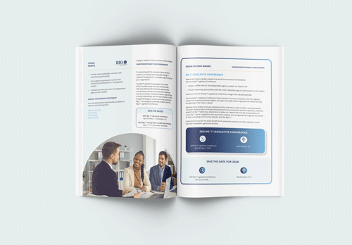
Brand Print Examples
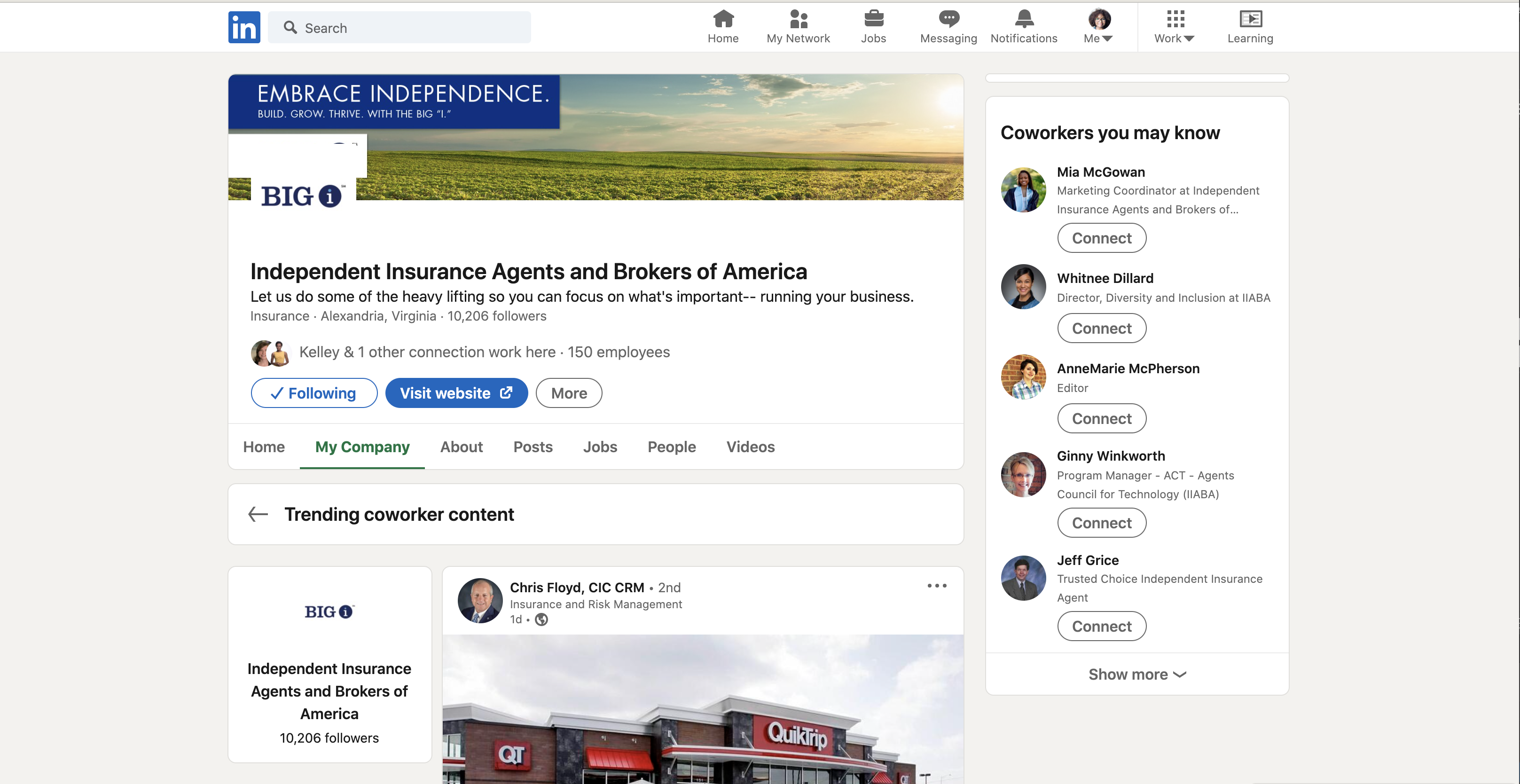
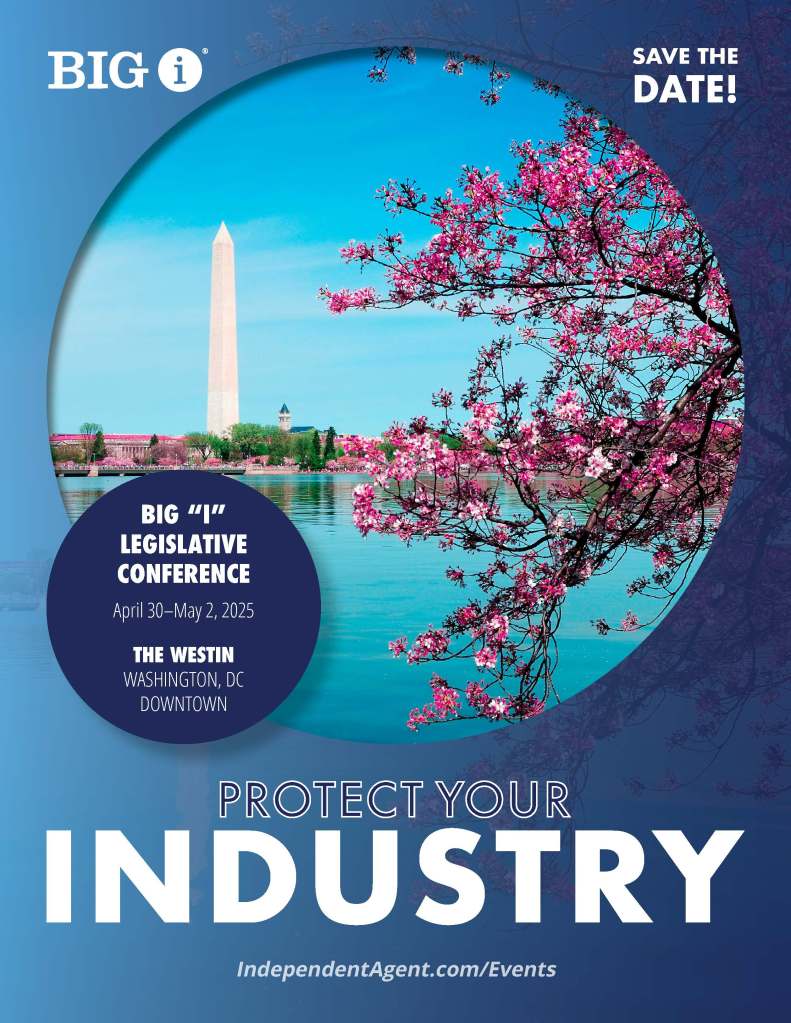
All print publications will include the Big “I” logo and use the preferred color palate. The Trusted Choice logo should be clearly displayed on the cover and when possible include “Empowering Trusted Choice® Independent Agents.”
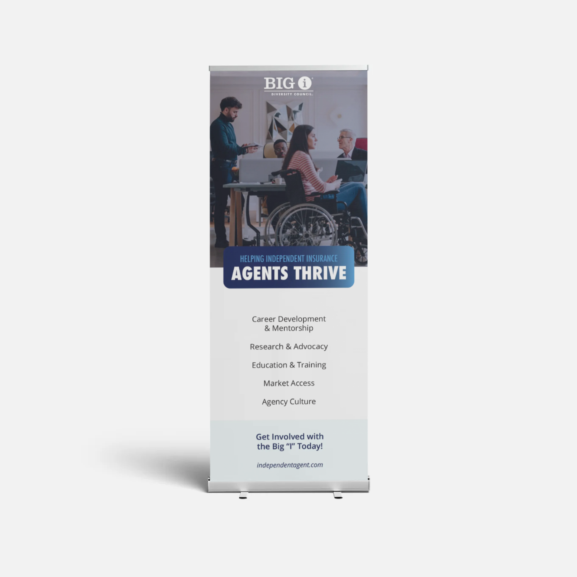
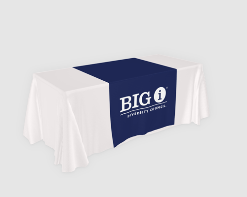
Marketing materials (postcards, flyers, etc.) should include the Big “I” logo or Big “I” program logo. Only one logo should be on each piece. Communications will create a standard Big “I” convention booth to use at state and industry events. The branding will be Big “I” and include one 6 ft table cloth and two quick screens that highlight our solutions simply.
Onsite materials will use the Big “I” logo and the meeting and event look/feel—consistent for every conference (Fall, Winter and Legislative Conference). Name badge holders, signs, handouts, program guides, slide decks.


Brand Web Examples
The website header will include the Big “I” logo, while program pages will include the program name. Homepage slider images will use colors, font, and graphic elements in the following guidelines. Sliders do not need to include program logo UNLESS they will also be shared with state associations.
All email footers and e-newsletter headers will include Big “I” logo and in some cases Big “I” and Trusted Choice (company relations, etc.)
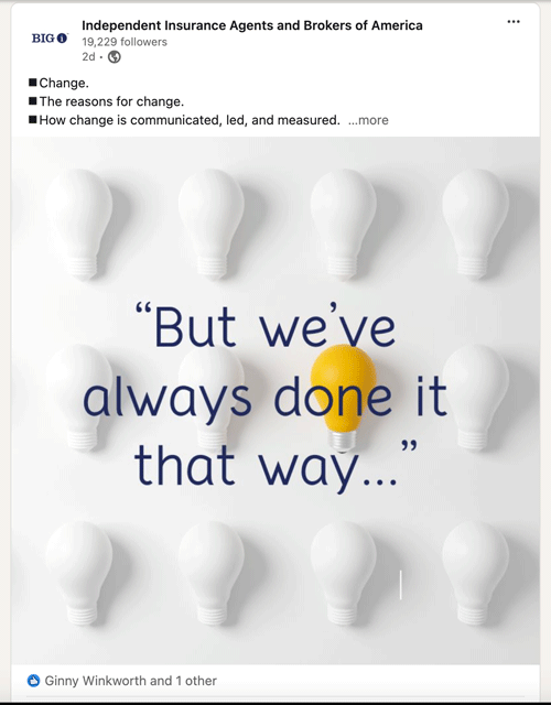
Program social media, though limited, will have the Big ‘I” logo with program name stacked below. All social media advertising content/graphics should include the Big “I” logo, if it is promoting any program services. Non-promotional content (reposts and holiday tips) does not need to include the association logo.
Presentations should include the Big “I” logo on the cover and closing slides.
Industry facing videos should use the Big “I” logo, however, if a video has a consumer angle, the Trusted Choice logo would be a better fit.